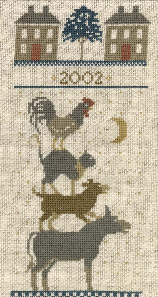
A very, very simple design. Do you think that the green used on the trees is too blue? If so, what colour do you suggest to go with the other colours that I noted in my last blog entry?
I like the tree as is, don't unpick it! It would be different if there were other shades of green in the design, but changing it to a brighter green may put the rest of the design out of whack! thanks for the kind comments on our blog....you made me smile! :)
10 comments:
This is very nice, well done.
I think it looks blue but that is the color they chose so I wouldn't chnage a thing. It blends into the rest of the desighn.. Very nice job..
Love it!! Hard to tell from the image is the tree is 'too' blue. Just know the entire thing looks great.
Have a good week.
Margaret
I think that it looks great! The tree fits the piece well . . .color and all! I personally would leave it as is. Great job and Congrats!
Second opinions are always good. OK, I'll leave it the colour it is. It's a sort of blue-green and it does suit. Thanks people.
congrats on the finish-very cute. I like the color of the tree-looks great.
congrats on the finish-very cute. I like the color of the tree-looks great.
It turned out great. As to the tree, I think the color looks fine so I'd leave it as is.
Sue
This looks beautiful! Good job! I am enjoying looking at your WIP's and other pieces! I'm loving the dream catcher one too!
~Lana~
I like the tree as is, don't unpick it!
It would be different if there were other shades of green in the design, but changing it to a brighter green may put the rest of the design out of whack!
thanks for the kind comments on our blog....you made me smile! :)
Post a Comment